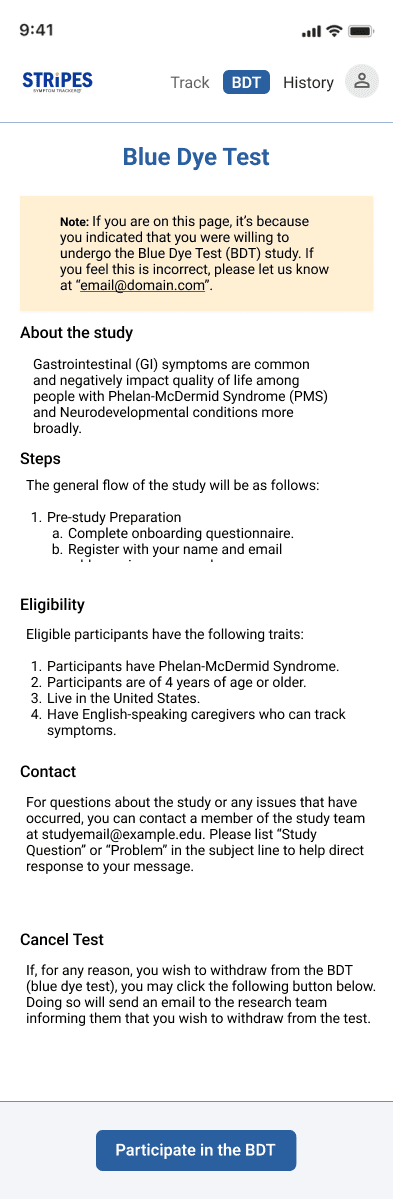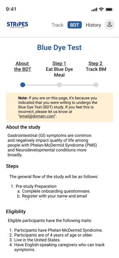
Blue Dye Test: a note on why you are seeing this page, then the study, its steps and who can take part
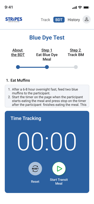
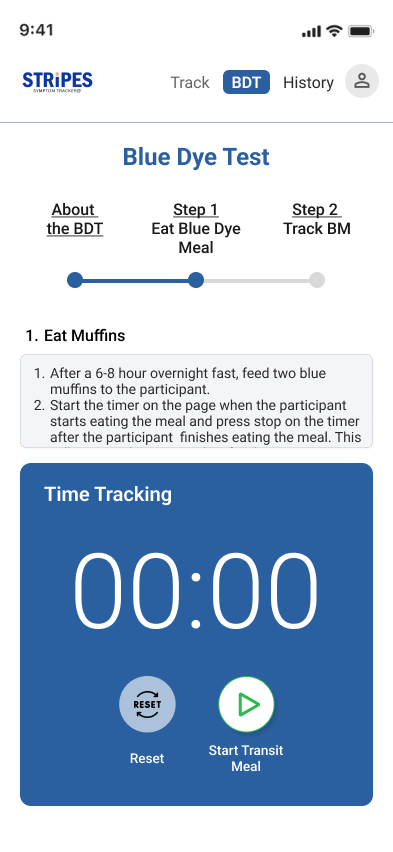
Blue Dye Test, Eat Muffins step: the timer ready with Start Transit Meal
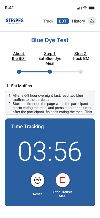
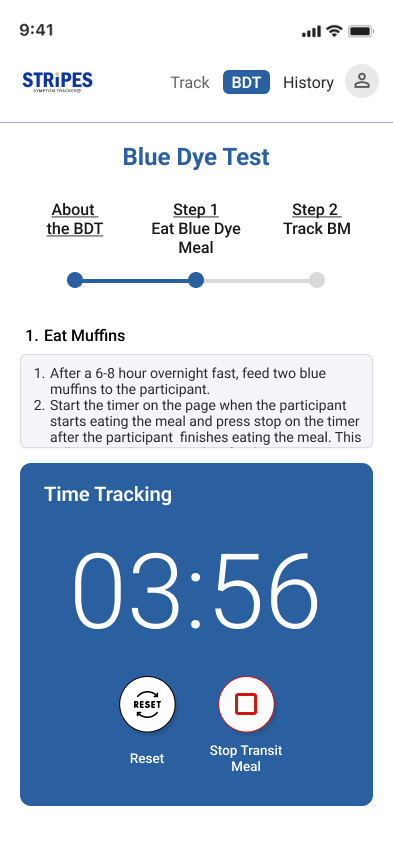
The transit timer running at 03:56, with Reset and Stop Transit Meal

STRiPES, a symptom tracker for families in a long-term medical study.

64%
less time to complete tasks, in usability testing
~10
participants in that testing
1 year
lead UX designer & PM, team of four
TL;DR

The Challenge

Caregivers of people with Phelan-McDermid Syndrome log sensitive data for a long-term medical study. The app was built for researchers: clinical words, a wall of rules, and tasks that took far too long.

Team & Time

August 2023 to May 2024 at the University of Miami UX Lab. Me as lead UX designer and PM, with a professor, a UX writer and a researcher-designer, alongside the study's doctors and researchers.

What I Did

Usability-tested the old platform, then redesigned it: a pain map people recognise, rules as steps, a familiar stopwatch, gentler words, an emoji pain scale, and consent you can withdraw at any time.

What Changed

Tasks took 64% less time in usability testing, and the clinical wording that caused visible discomfort is gone, while the study still gets every score it needs.

01 – The Mission

Accuracy through empathy.

STRiPES was built with clinical doctors and medical researchers at the University of Miami UX Lab, to help caregivers record sensitive data for a long-term medical study: the Blue Dye Test.

The problem

The existing platform was built for researchers, not families. Its cold, clinical language caused visible discomfort during testing.

The people

Caregivers like Evelyn (a persona; the real participants are confidential): time-stretched, anxious, running a household and caring for someone with a complex syndrome.

The tension

The study needs accurate, detailed data. But the act of recording it was adding to the caregiver's burden.

How do you collect clinical-grade data without making a hard day harder?

02 – What Testing Showed

We tested the old platform first. It hurt.

Before redesigning anything, we ran usability studies on the platform the researchers gave us. The problems showed up immediately.

Emotional friction

Clinical terms like “abdomen” and “fecal matter” caused distress.

Cognitive overload

The Blue Dye Test rules were a dense wall of text. Mistakes were almost guaranteed.

Time sink

Every task took so long it put the whole long-term study at risk.

03 – Key Design Decisions

Five decisions for a user under duress.

Each one is something you can try, with a short log of why.

DECISION 01

THE PAIN MAP

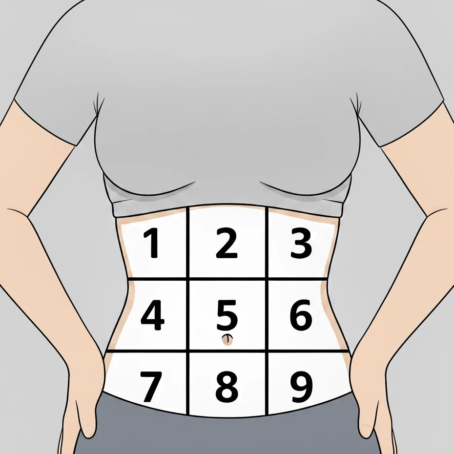
The torso that needed arms.

The doctors needed a pain-location map that was medically precise and inclusive. My first version failed in testing. The fix was almost embarrassingly simple.

Try it · the pain map

A gender-neutral torso. Where is the tummy?
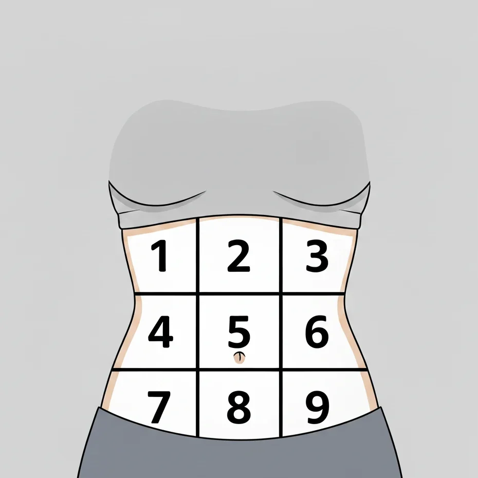
Tap where it hurts.

I made this gender-neutral torso with AI and Photoshop so it would be medically precise and inclusive. In testing, caregivers were confused by the shape and slow to find their way.

My two drawings from the project. In testing, caregivers took too long to recognise the armless one.

Decision log

The failure
A gender-neutral torso, made with AI and Photoshop. Caregivers were confused and took too long to recognise the shape.
The realisation
Chasing clinical abstraction, we lost the most basic mental model of a body: it had no arms or hands.
The fix
Minimal arms and hands to frame the torso. The delay disappeared. Basic visual context beats clinical abstraction.
DECISION 02

COGNITIVE LOAD

The wall of rules, broken into steps.

Nobody reads dense instructions while they're stressed. So we stopped asking them to.

Compare · the Blue Dye Test rules

What caregivers were asked to read, under stress.

Before you begin, the participant must complete a 6–8 hour overnight fast. Feed two of the blue muffins sent for the study to the participant; press the start transit timer button the moment the participant begins to eat the muffins and the stop transit timer button when the participant has finished eating. If an error occurs while timing, press reset and contact the study team at the email provided. Afterwards, record each of the participant’s bowel movements and note the colour, consistency and any other symptoms, continuing until the participant has a blue-coloured bowel movement, then repeat the process with the remaining two muffins, recording bowel movements again until the study is complete.

Recreated from the study rules in my screens; the original was one dense block like this.

Decision log

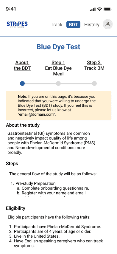
Sequential steps
The task became small, low-commitment steps. Only the rule that matters right now is bold.
Visual breadcrumbs
A progress bar shows where you are: about the test, eat the blue dye meal, track bowel movements.
DECISION 03

MENTAL MODELS

A stopwatch they already knew: the iPhone clock.

Every caregiver we tested was familiar with the iPhone clock, so the blue dye meal timer mirrors it. And the buttons only come alive when they make sense.

Try it · the transit meal timer

A stopwatch caregivers already know how to use.

STRiPES

Blue Dye Test

Time Tracking00:00
ResetStart Transit Meal
  1. Before the mealOnly Start is active. Reset and Next stay quiet.
  2. EatingStart becomes Stop. Reset wakes up, in case something goes wrong.
  3. FinishedStop and Reset go quiet. Next lights up.

Decision log

Borrowed familiarity
No new pattern to learn on a hard day. The timer looks and behaves like the clock app.
Context-aware buttons
Start turns into Stop only while the meal is being timed, Reset is there for mistakes, and Next waits until the step is done.
DECISION 04

COMPASSIONATE COPY

Gentler words, and a pain scale you can feel.

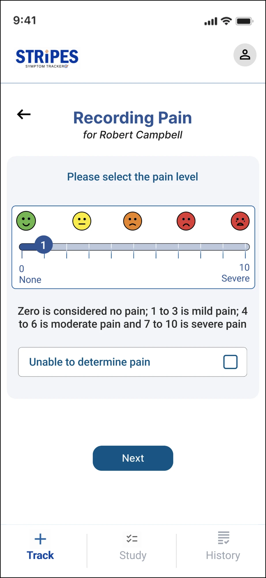
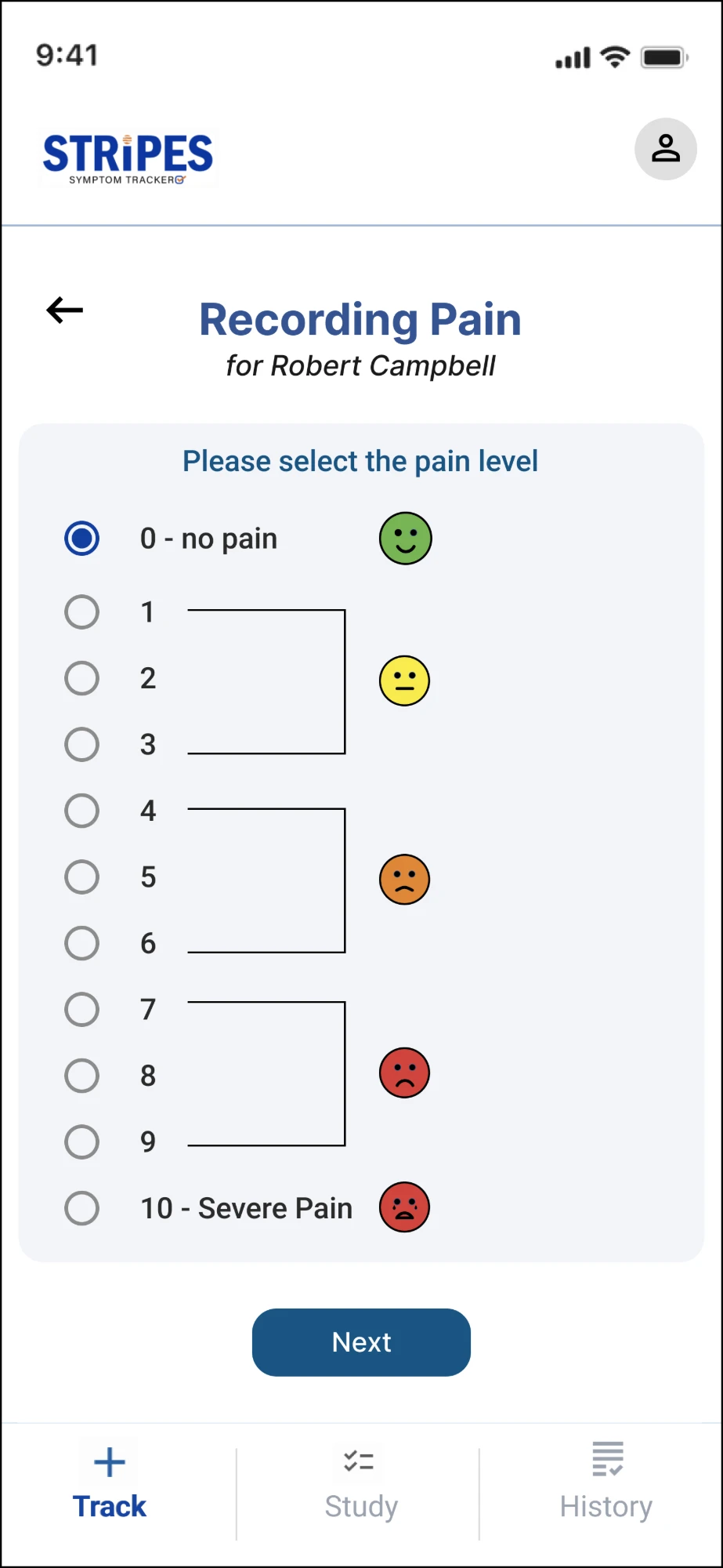
We traded clinical terms for the words caregivers actually use: “tummy” or “stomach” instead of “abdomen”. And the rigid pain recorder became a visual scale that still gives the researchers their number.

Try it · recording pain

First, what did you notice?

STRiPES

Recording Pain

for Robert Campbell

Select all the signs and symptoms that apply

Pick at least one.

Plain words a tired caregiver recognises. Next stays inactive until something is selected, and the small × undoes a choice.

Labels and the scale wording are from my STRiPES screens.

Decision log

Reframing language
Clinical labels were rewritten for a person under stress, with a UX writer on the team.
Visualising sensitivity
An emoji scale from happy green to distressed red: quick, non-verbal, and mapped straight to the 0–10 score the study needs.
DECISION 05

CONTINUOUS CONSENT

The caregiver is always in control.

Taking part in a study shouldn't feel like a trap. Notes are written without pressure, and a way out of the study is always there.

The real screens

Know who to ask. Know how to leave.

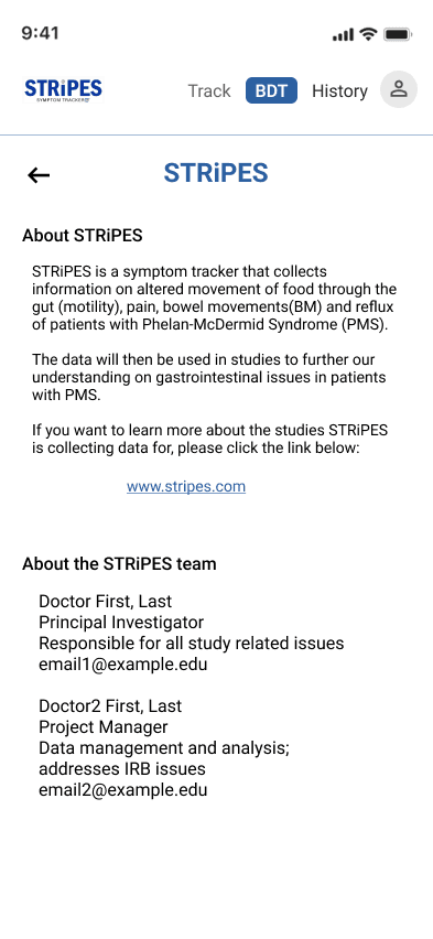
About STRiPES: what the app collects and why, and the STRiPES team with their roles and emails
About STRiPES“The data will then be used in studies to further our understanding…”What the app collects and why, and the real people behind the study.
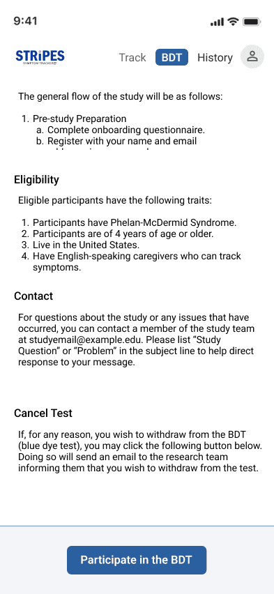
The bottom of the Blue Dye Test page: eligibility, contact, how to cancel the test, and a Participate in the BDT button
Cancel, any time“If, for any reason, you wish to withdraw from the BDT…”How to withdraw sits right above the button that starts it.

Decision log

Non-pressuring notes
Every page explains why you’re seeing it, with no push to continue.
Always a way out
A Withdraw from Study option stays visible, so the caregiver always feels in control of taking part.

04 – The Screens

The Blue Dye Test, step by step.

Click through · the real screens

From “why am I seeing this?” to recording pain.

About STRiPES page with the team's roles and contacts
1 / 7

05 – The Result

Protecting the data and the human.

64%less time to complete tasks

Measured in usability testing with about ten participants. Shorter tasks meant fewer chances for error, which matters for a study that runs for a long time.

Outcomes

Measured

From usability testing. The test packets themselves stay with the lab.

  • 64%less time on task, about 10 participants

How I’d measure it

  • Time on taskTime to complete the study tasks in moderated usability testing.
  • Error rateMistakes per task while following the Blue Dye Test steps.
  • Emotional comfortSigns of distress observed during sessions, and a short post-session check-in.

06 – Reflection

Empathy is not a soft skill. It's a constraint.

STRiPES showed me that empathy belongs in the requirements, next to accuracy. Every calculated decision was made for a person under duress, and that is exactly what made the data better: easier tasks, fewer errors, and a study that is easier to stay in.

It also taught me to let testing prove me wrong. My first torso was the “correct” one. It just wasn't the one people could use.

The most accurate data comes from the people you were kindest to.