case study 02 of 04
What happens when students say no to everything you built.
A pre-seed pivot, twelve teenagers, and the strategy decision that secured the funding round.
Role
Product strategist
Company
MU20, EdTech, Gen Z
Year
2025, 4-week sprint
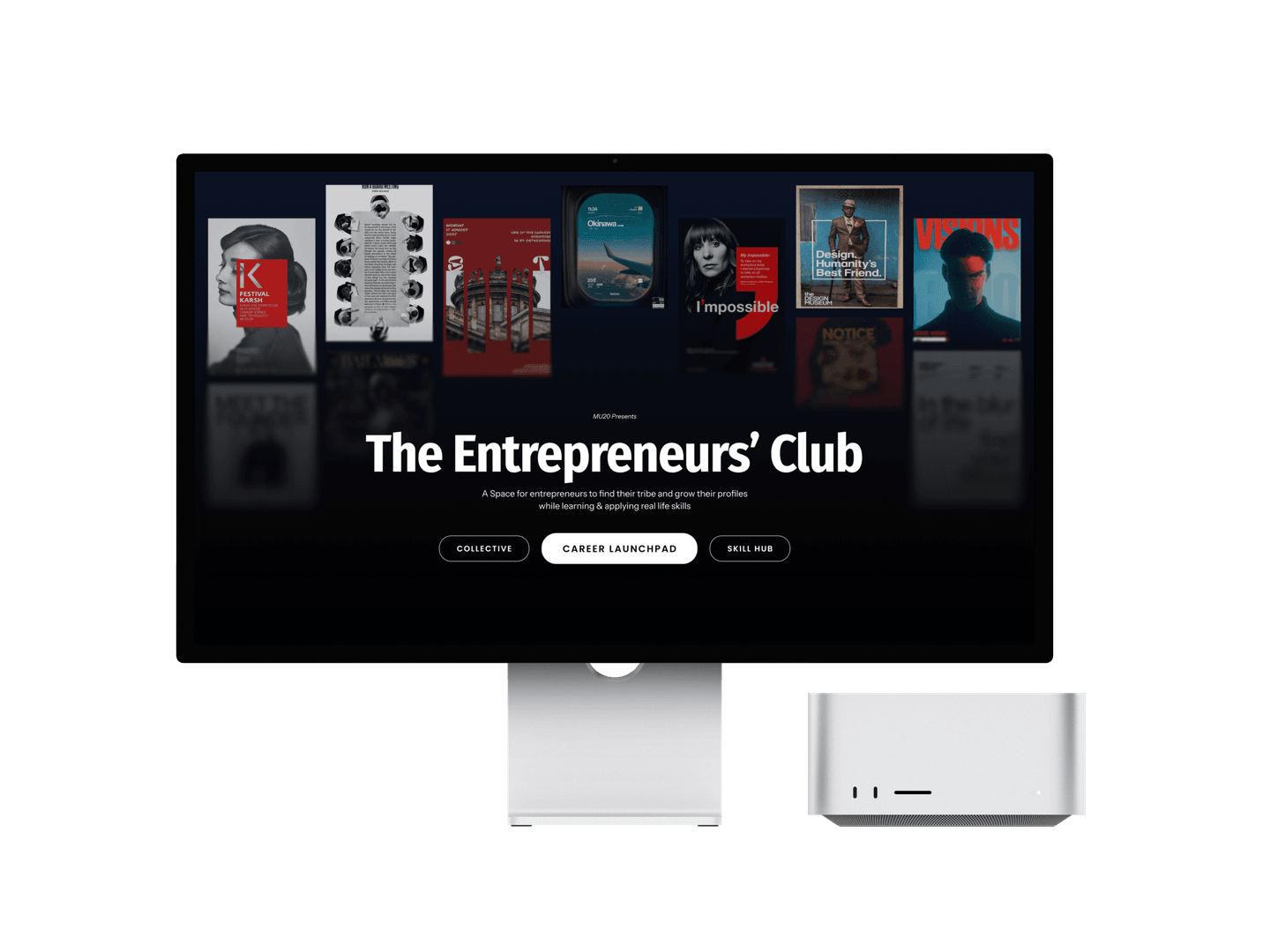
the prototype that walked into a pre-seed funding meeting.
The Challenge
50+ features, zero user research, 4 weeks to a pre-seed meeting. The real challenge: building solutions before understanding the problem.
The Impact
Pre-seed funded in January 2026. The prototype convinced investors not just with screens, but with a fundable thesis.
My Output
Feature prioritization across 50+ items, psychometric onboarding, Micro Trials, Explorer/Focus architecture, AI Pathway Builder, Atomic Design System.
The Learning
The most dangerous moment in a sprint is when the team mistakes momentum for direction. Thirty minutes of honest research changed the entire product.
50+ features. Zero conversations with students.
MU20 was my first company. So when they came back with a problem, asking me to help define a product that could reshape how Gen Z students find career direction, I said yes without hesitation.
What I walked into was messier than the brief suggested. 50+ features mapped across ten modules: onboarding, discovery, clubs, opportunities, profiles, progress tracking, an AI coach, a compete layer, college tools, account settings.
The energy in the room was high. The direction was not.
This is a pattern I have seen in early-stage startups. When the deadline is a funding meeting, teams move toward output. Features get named, flows get sketched, solutions get momentum, all before anyone has defined the actual problem. It is not a failure of intent. It is what happens when the clock is running.
I wanted to slow down just enough to do one thing right. I made the case for user research. Not a long study. Just real conversations with real students before we committed to a direction.
The team agreed. We talked to 10–12 high school students. I was not running the sessions, but I made sure they happened. What those students told us changed everything.
The team had momentum. What we did not have was a reason to build any of it.
We were building a course platform. They didn't want one.
We went into research thinking we were building a smarter way to deliver educational content. We came out knowing we were not building a course platform at all.
The students were clear. Not hostile, just honest. They did not need more courses. They already had school for that.
STUDENT INTERVIEWS · N=12 · OCTOBER 2025
“I do not know what I am actually good at beyond my marks.”
Student #4 · 11th grade
“I do not know if I will like a career until I try it.”
Student #7 · 12th grade
“Counseling and aptitude tests feel like a generic advice scam.”
Student #9 · 11th grade
Not one student said they needed another course.
We had been designing a smarter way to package and deliver educational content. What students actually needed was something closer to an action engine. A way to try things, not just learn about them.
Advice does not change behavior. Courses are advice. Clubs, challenges, real opportunities with real stakes: those are action.
The pivot was this. We went from course-led to opportunity-led. Every feature across those 50-odd backlog items got filtered through one question: does this help a student do something, or does it just tell them something? If it only told them something, it got cut or pushed to V2.
Three modules survived that filter. They became the spine of the MVP.
Discover
Know yourself.
Do
Try something real.
Show
Make your effort visible.
MU20 is an action engine, not a guidance engine.
Three questions every feature had to answer.
Once the pivot was clear, we needed to align on what success actually looked like. Not features. Not screens. Three questions that had to be true for the MVP to work.
QUESTION 01
Does a student understand what to do on day one without anyone explaining it to them?
QUESTION 02
Does the platform help them actually do something, not just browse?
QUESTION 03
Do they come back on their own?
Everything we designed had to serve at least one of those three. If it did not, it did not ship.
Three questions. One filter. No exceptions.
Five decisions, defended twice.
Every decision below is structured the same way: what it is, the design logic, and the product logic. Two defenses, because the best decisions on this project served the user and the business without compromising either.
ONBOARDING
The psychometric onboarding.
WHAT IT IS
Before a student touches any feature, the platform asks a set of indirect questions designed with a child therapist's input. Not ‘what is your dream job?’ but ‘what does the view from your dream room look like?’
The answers feed a profile vector that shapes every recommendation the platform makes from that point forward.
DESIGN LOGIC
Standard onboarding questions produce standard answers. A student who has been asked ‘what do you want to be when you grow up?’ for twelve years has a rehearsed answer. Indirect questions bypass that performance layer and surface something more honest.
PRODUCT LOGIC
For investors, this signaled that the team had thought seriously about the intake problem and designed around it with external expertise. That level of intentionality on the first screen sets the tone for everything that follows.
CORE LOOP
Micro Trials, the most-watched career format turned into a product.
WHAT IT IS
Short, hands-on experiences that let students do the actual work of a career for two to four hours. No commitment, no stakes, no formal enrollment. UX design student gets a usability task. Law student gets a mini case analysis. Entrepreneurship student gets a problem brief and pitches a solution.
The AI analyzes how they engage, not whether they got it right, and surfaces skill signals like ‘you showed strong systems thinking, want to try product management next?’
DESIGN LOGIC
The most-watched career content on the internet is ‘day in my life as a ___.’ Students do not want to be told what a job is like. They want to feel what it is like.
The key choice was removing pass/fail entirely. The system tells you what your behavior revealed about your strengths. That reframe changes the emotional experience from a test to a discovery.
PRODUCT LOGIC
Micro Trials solve the single biggest drop-off problem in career platforms: students browse, feel overwhelmed, leave without doing anything. A trial forces a decision point in the best way possible. Low enough stakes to start, engaging enough to finish.
The behavioral data it generates is also the most valuable signal in the platform: not self-reported interest, but demonstrated tendency.
FORK ON SCREEN ONE
The Explorer / Focus toggle.
WHAT IT IS
At the start of onboarding, students choose their mode. Explorer drops them into an open, curiosity-driven feed. Focus fast-tracks students who already have a hypothesis directly to a domain deep dive.
DESIGN LOGIC
A single onboarding flow that treats all students as undecided creates immediate drop-off for those who already have direction. Forcing exploration on a student who knows they want architecture is patronizing. Forcing commitment on a student with no idea is terrifying.
One question. Two completely different emotional experiences downstream.
PRODUCT LOGIC
Drop-off in onboarding is where most EdTech products lose users permanently. The toggle meant that regardless of where a student was in self-awareness, the first experience felt right-sized. For investors, a signal of product maturity.
ARCHITECTURE
The Wizard of Oz, named.
WHAT IT IS
The front-end prototype was designed to feel like an intelligent, personalized AI system. The backend for the MVP was rule-based matching. No real recommendation engine. No trained model. The experience felt personalized. The mechanism powering it was human judgment dressed as machine intelligence.
DESIGN LOGIC
Four weeks, no engineering runway. The Wizard of Oz approach let us validate the value of personalization before investing in the technology to automate it. The question we were testing was not ‘can AI do this?’ It was ‘do students respond differently when recommendations feel personal?’
PRODUCT LOGIC
Investors at pre-seed are not funding a tech stack. They are funding a thesis. The prototype proved our thesis experientially without a single ML model. Naming the strategy explicitly, calling it Wizard of Oz, demonstrated that we understood the difference between validating value and building infrastructure.
That is a product-thinking signal, not a confession.
THE COMMERCIAL SPINE
The AI Pathway Builder.
WHAT IT IS
A student selects a North Star: ‘I want to work at a top design studio.’ The system generates three personalized pathways: one optimized for cost, one for time, one for skill-building. Each pathway is pre-populated with real, vetted opportunities in sequence.
The path becomes a sticky progress bar throughout the entire platform.
DESIGN LOGIC
Opportunity platforms fail because they show you everything and help you decide nothing. The Pathway Builder inverted that model: declare a direction first, the system builds the path toward it.
The three variants respected a real constraint: a student in a smaller city with a tight budget needs a different path than a student in a major metro with time and resources. Designing for those differences was a choice about equity as much as UX.
PRODUCT LOGIC
This was the feature that made investors lean forward. A student who commits to a pathway has made a micro-contract with the platform. That commitment is the foundation of retention, re-engagement, and the B2B monetization model.
Every opportunity slotted into a pathway is a potential placement for a paying partner. The pathway is not just a UX feature. It is the commercial spine of the product.
THE B2B SURFACE
The Opportunity Vault.
WHAT IT IS
A searchable, filterable marketplace of internships, fellowships, scholarships, and competitions, manually curated for the pre-seed launch. Each opportunity carries a structured skill tag, a difficulty rating, and a pathway-fit indicator.
The same vault the student browses is the inventory the partner organization sells into.
DESIGN LOGIC
Opportunity boards usually feel like job sites. We designed the vault to feel like a curator's shelf: structured tags, soft cards, no urgency push. Browsing here should feel like exploring possibilities, not getting hired.
PRODUCT LOGIC
The vault is the platform's revenue surface. Every slot inside a student pathway is inventory that universities, fellowship programs, and edtech partners can sponsor. Designing the student-facing browse and the B2B catalog as the same object meant the marketplace economics scaled with usage, not headcount.
Six decisions. Each one served the student and the investor. Without compromising either.
A prioritization record, not a failure list.
The gap between what was designed and what was built is not what didn't make it. It's what we deliberately cut to keep the core loop intact: Discover, Do, Show.
SHIPPED FOR MVP
What made it into the room.
DESIGNED, V2 CANDIDATES
What we cut on purpose.
The cuts followed one rule: does this exist to validate the core loop? If it didn't serve Discover, Do, or Show directly, it went to V2.
I can articulate exactly what I'd build first in V2, why, and how I'd measure if it worked.
In the room, with twelve teenagers between us and the check.
In January 2026, the founders walked into a pre-seed funding meeting with our high-fidelity prototype and early beta data. They walked out with investment.
THE OUTCOME
A prototype walked in. An investment walked out.
funded
The design did specific work in that room. Psychometric onboarding reframed intake. Micro Trials demonstrated a new category. The Pathway Builder made the abstract concrete: here is what you do Monday morning.
The work I am most proud of is not any single screen. It is that the product we shipped to investors was fundamentally different from the product we started designing, because we stopped to ask twelve teenagers what they actually needed.
This project taught me something I will carry into every engagement after it. The most dangerous moment in a product sprint is when the team mistakes momentum for direction. We had energy. We had features. We had a deadline. What we almost did not have was a reason to build any of it.
Designing for funding is a unique constraint. You are simultaneously solving for the user sitting in front of the product and the investor sitting across the table evaluating it. The best decisions on this project were the ones that served both without compromising either.
The roadmap I'd build next.
The MVP got us funded. The next three priorities turn the prototype into a category.
NEXT · 01
A real recommendation engine.
Replace the Wizard of Oz with a trained model that learns from psychometric signal, Micro Trial outcomes, and pathway completion. The categorical proof exists; now make it cheap to deliver at scale.
NEXT · 02
A club community surface.
Students don’t just want pathways, they want peers walking the same path. A lightweight community layer turns the platform from a tool into a place. It also raises retention without raising acquisition cost.
NEXT · 03
A parent & counselor layer.
Add a low-touch dashboard for the adults already shaping the student’s decisions. Done right, it earns parent trust without taking the student’s agency away, and it opens a second monetizable surface.
What MU20 taught me about designing for funding.
Designing for an investor meeting is a different brief than designing for a daily-active user. The prototype has to do double duty: hold up under a teenager's thumb, and hold up under an analyst's spreadsheet. Every decision had to be defensible from both sides of the table.
The biggest lesson was learning when to fake the infrastructure so you can prove the value. Calling Wizard of Oz by name forced the room to focus on the right question: do students want this, before we ask, can we build it.
The goal was never to build a platform. It was to build a mirror.