case study 04 of 04
Making career paths accessible to anyone with ambition and a laptop.
Designing onboarding, notifications, and a career selection system for an AI EdTech platform, part-time, across three teams of designers.
Role
Associate Product Designer
Company
Rita ABC (Mondai)
Year
2025
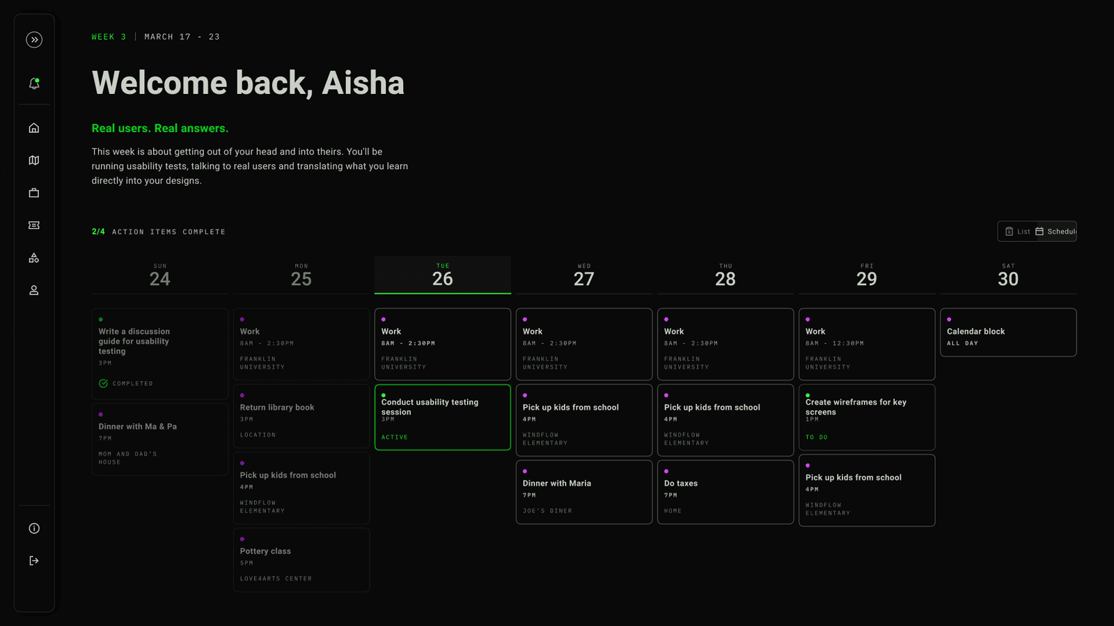
the platform that launches at NYC Tech Week 2026.
The Challenge
Mondai is an AI platform that helps students explore career paths without a traditional degree. I joined part-time to a team built entirely of designers, split across three pods: research, mobile, and web. My job was to own specific features on the web team and ship them well, even when my hours were inconsistent.
My Output
Mobile-to-web migration research, progressive onboarding redesign, onboarding completion animation, career selection modal, full notification system spec, resources screen, emoji system overhaul, weekly accessibility audits.
The Impact
The platform launches at NYC Tech Week 2026. The onboarding animation became a signature first-impression moment for the product. The progressive onboarding replaced a 10-question wall that was killing new users before they started.
The Honest Truth
This was my first part-time design role. I learned that the hardest design skill is not craft. It is managing your own time and context when you are not in the room every day. This case study is honest about what that looks like.
A team built entirely of designers. That was the first surprise.
Mondai started with a personal conviction. The founder's parents were immigrants. He watched them navigate a system that judged credentials over capability, where getting in the door mattered more than what you could do once you were inside. Mondai was his answer: an AI-powered platform where anyone can learn, build a portfolio of real projects, and connect directly with companies, no traditional interview required.
The vision is bigger than what exists today. The long-term goal is a world where you send a company a video about why you love what they do, and you get matched based on your work, not your resume. Right now, we have built the first layer: a personalized, AI-driven learning system where anyone can start exploring career paths and building real skills.
When I joined, the team was structured unlike any I had worked on before. Three core pods, all designers: a research team, a mobile team, and a web team. I was on the web team.
The product already had a visual direction when I arrived. Brutalist. Dark backgrounds, neon green accents, bold mono typography, generous whitespace. The aesthetic was set. My job was not to reinvent the look. It was to own specific features, make them excellent, and ship them on a part-time cadence.
That last part mattered more than I expected. Part-time design is a different discipline. You cannot rely on being in every meeting or catching every Slack thread. You have to be efficient, decisive, and comfortable with gaps. Sometimes I was deep in the work for weeks. Sometimes I stepped back entirely. The rhythm was inconsistent, and I had to learn to be useful anyway.
The research said web. We listened.
When I joined, the team had a library of mobile-first concepts. Screens, flows, components, all designed for phones. But nobody had validated whether mobile was actually where students wanted to learn.
I led an initiative to look at user behavior. The findings were clear: for the deep, focused work that Mondai required, students preferred web sessions over mobile. This was not casual browsing. This was career exploration, AI-guided pathways, long-form content. That kind of attention lives on a laptop, not a phone.
I surfaced the data. The team made the call together: pivot to a web-based MVP. Focus resources on the platform that matched how students actually used the product.
Then we had to actually do it. I was part of the migration, converting existing mobile designs into responsive web layouts with full feature parity across six core product areas. Every screen had to work on the new surface without losing what made the mobile versions good.
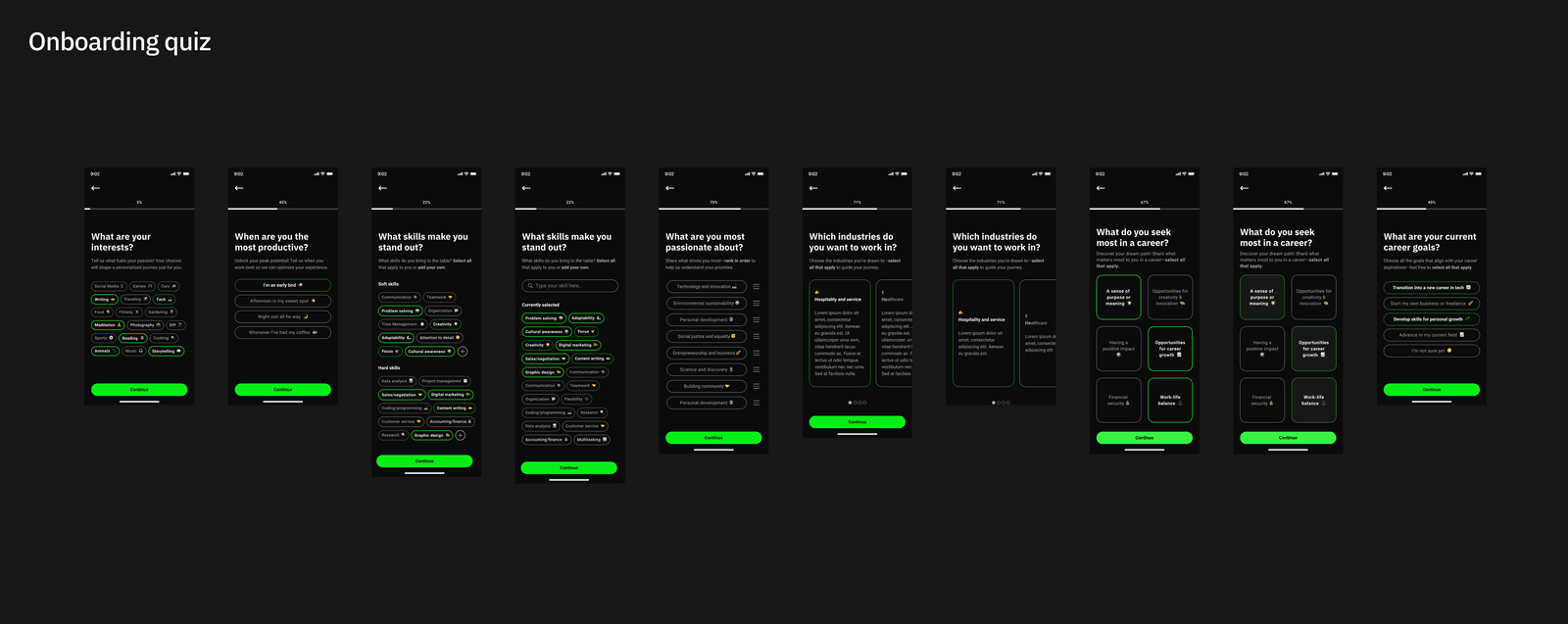
The pivot was not dramatic. It was a quiet, research-backed decision that saved the team from building the right product on the wrong platform.
Four features, each with a different job.
PROGRESSIVE ONBOARDING
We turned the wall into a path.
The original onboarding was a wall. Ten-plus questions, upfront, before you could touch anything. Career goals, time preferences, passions, motivations, interests. All of it, immediately. It was thorough. It was also the reason new users were leaving before they started.
The AI needs that data to personalize the experience. That is real. But asking for it all at once treats the user as a data source, not a person.
We moved to progressive onboarding. Instead of interrogating users at signup, we integrated the questions into the user's natural exploration. As you browse pathways, the AI observes what you engage with and asks small, contextual questions along the way. It learns from your actions in real-time rather than your answers in a form.
The result: the AI gets the same signal. The student never feels surveilled.
THE SIGNATURE MOMENT
The onboarding completion animation.
This is the piece I am most proud of on the entire project.
When a student finishes onboarding, something needed to happen. Not a generic “Welcome!” screen. Not a loading spinner. A moment that felt like arriving somewhere.
I designed it through five iterations. The final version works like this: a numbered list of your selected interests appears on screen, each one feeding into the Mondai logo mark. As each item enters the logo, a liquid fill rises inside it. When all items are consumed, the filled logo contracts into a single pressure point, holds for a beat, then bursts into a radial green-white bloom with a hyperspace star field launching outward. Then the next screen arrives.
It takes about three seconds. But those three seconds are the moment the product says: we heard you, we built something from what you told us, and now we are taking you somewhere.
“Three seconds. That is how long the product has to say: we heard you.”
FIRST-TIME VS RETURNING
Career selection modal.
Students return to Mondai at different points in their journey. A first-time user selecting a career path is in a completely different headspace than a returning user who wants to change direction.
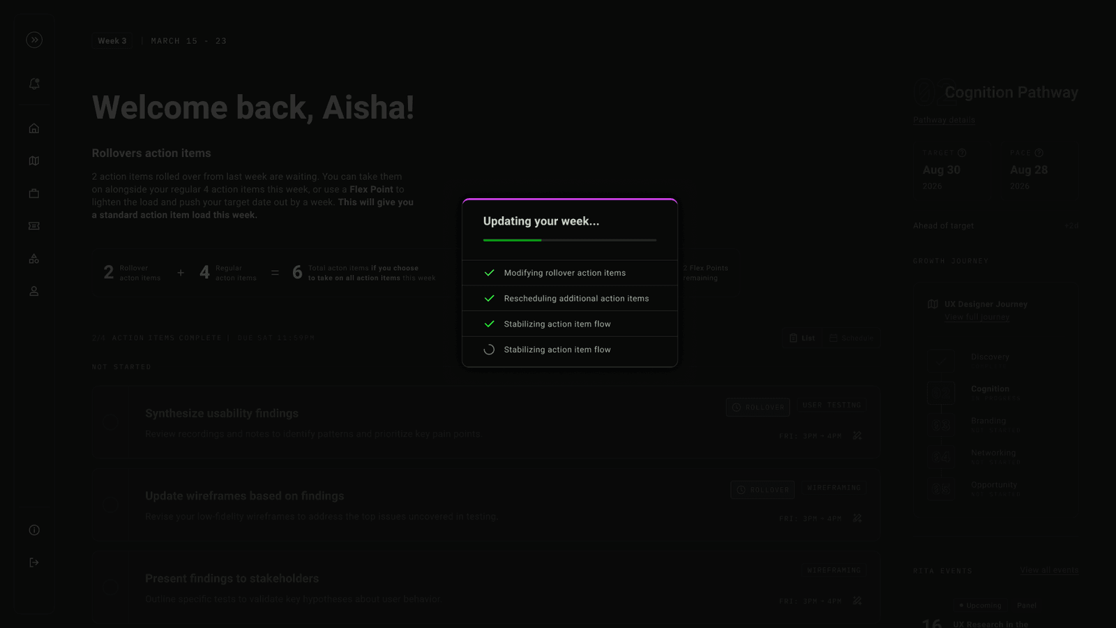
I designed the career selection modal with two distinct states: a first-time flow that guides discovery, and a returning flow that respects the decision you already made while making it easy to pivot. The difference is subtle in the UI but significant in the emotional experience. A returning user should never feel like they are starting over.
NOTIFICATIONS, RECONSIDERED
The notification system.
Notifications are the most underestimated design surface in any product. They are also where most products feel the most generic.
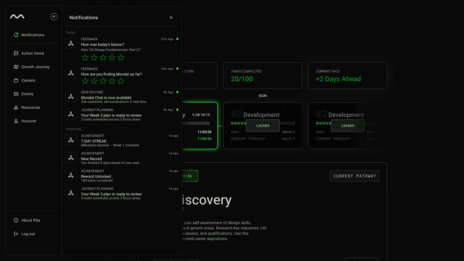
I designed the full notification system from scratch: in-app, email, and push specifications across twelve-plus trigger types. Every notification had to match Mondai's dark terminal aesthetic. Every notification had to earn its interruption.
The spec became a reusable component system adopted across the product, replacing what had been a fragmented collection of ad-hoc alerts with no consistency.
Brutalist does not mean inaccessible.
The brutalist aesthetic was already in place when I joined. Dark backgrounds, neon green, bold type, raw edges. It looked striking. The question was whether it could also be inclusive.
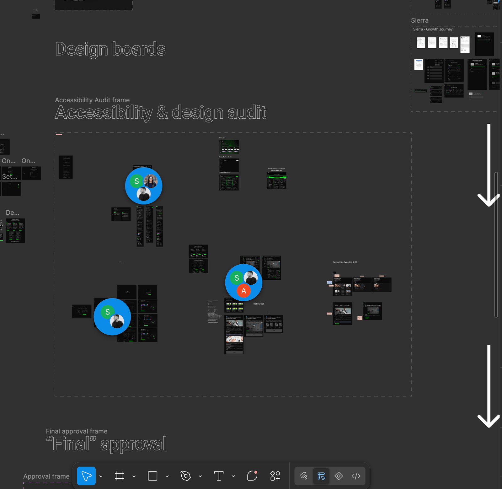
Every week, I met with our dedicated Accessibility Designer to review every new component and flow. We did not just check WCAG boxes. We redesigned based on what we found. This was especially critical for the Resources and Action Items sections, where long-form information had to be digestible for users with diverse needs.
Color contrast against dark backgrounds. Focus states on neon-accented elements. Screen reader behavior for the brutalist layout. Touch targets inside the dense terminal-style UI. Each one was a design problem that did not have an obvious answer inside the existing aesthetic.
The process transformed the design system from a visual library into a robust, compliant framework. Brutalist on the outside. Accessible underneath.
Not every decision needs a section. Some just need to be right.
THE EMOJI OVERHAUL
The platform's emoji set felt generic and disconnected from the brutalist tone. I replaced the entire set with custom-selected alternatives that matched the product's personality. A small change that affected every screen.
THE RESOURCES SCREEN
Students needed a place to find learning materials, guides, and references without leaving their pathway flow. I designed it as an integrated surface, not a separate section, so resources felt like part of the journey rather than a detour.
COMPONENT CONTRIBUTIONS
Working within the design system, I built and refined specific components that shipped across multiple features. Each one followed the same rule: match the aesthetic, pass the accessibility audit, work on every breakpoint.
The hardest skill was not design. It was time.
Part-time design sounds simple until you try it. You miss context. You rejoin meetings where decisions were made without you. You have to trust that the work you shipped last week is still intact, and sometimes it is not.
What I learned on Mondai is that part-time does not mean partial. It means you have to be more intentional with every hour. You cannot afford to explore three directions when you only have time for one. You have to arrive with a point of view, defend it clearly, and ship it before the window closes.
That constraint made me a better designer. Not because it was comfortable, but because it forced me to separate what mattered from what was just interesting.
Mondai launches at NYC Tech Week 2026. I will be watching from a different city by then, but the onboarding animation, the notification system, the career modal, the resources screen, those will be in the room. That is enough.
“Part-time does not mean partial.”